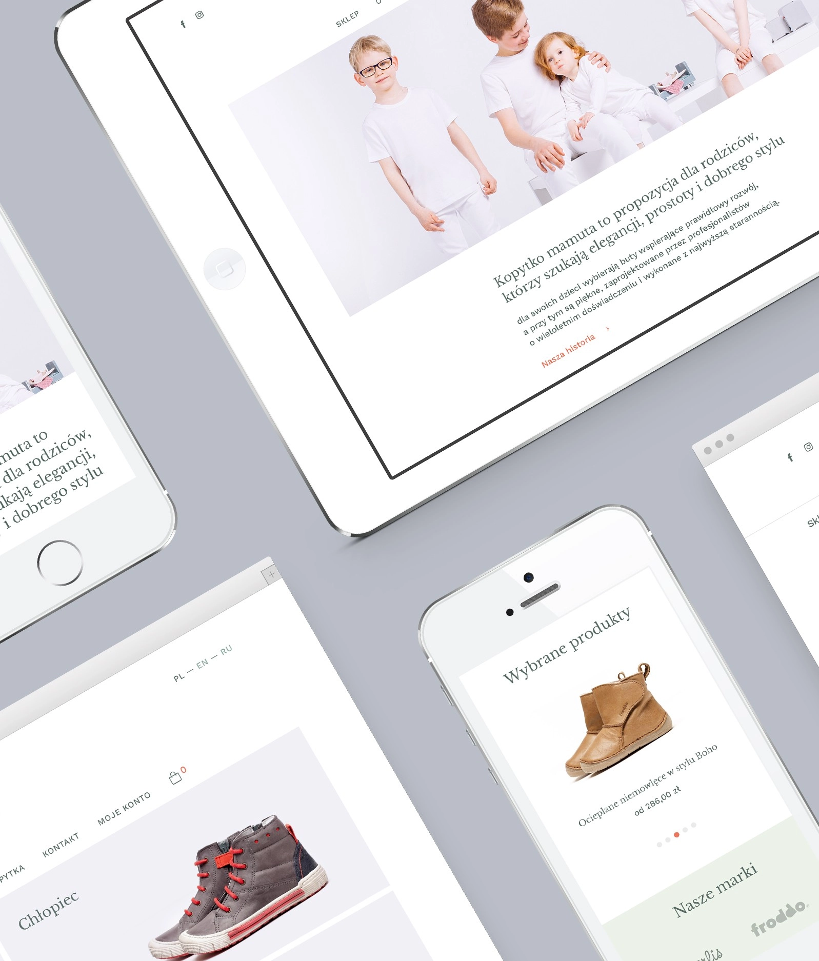
Kopytko Mamuta — Selection of best shoes for child’s first steps
Trusted local shop with selection of healthy shoes fof babies, toddlers and children. Adressed to parents choosing the right shoes to support proper kids' foot development and at the same time are elegant, classic and beautifully crafted by professionals.
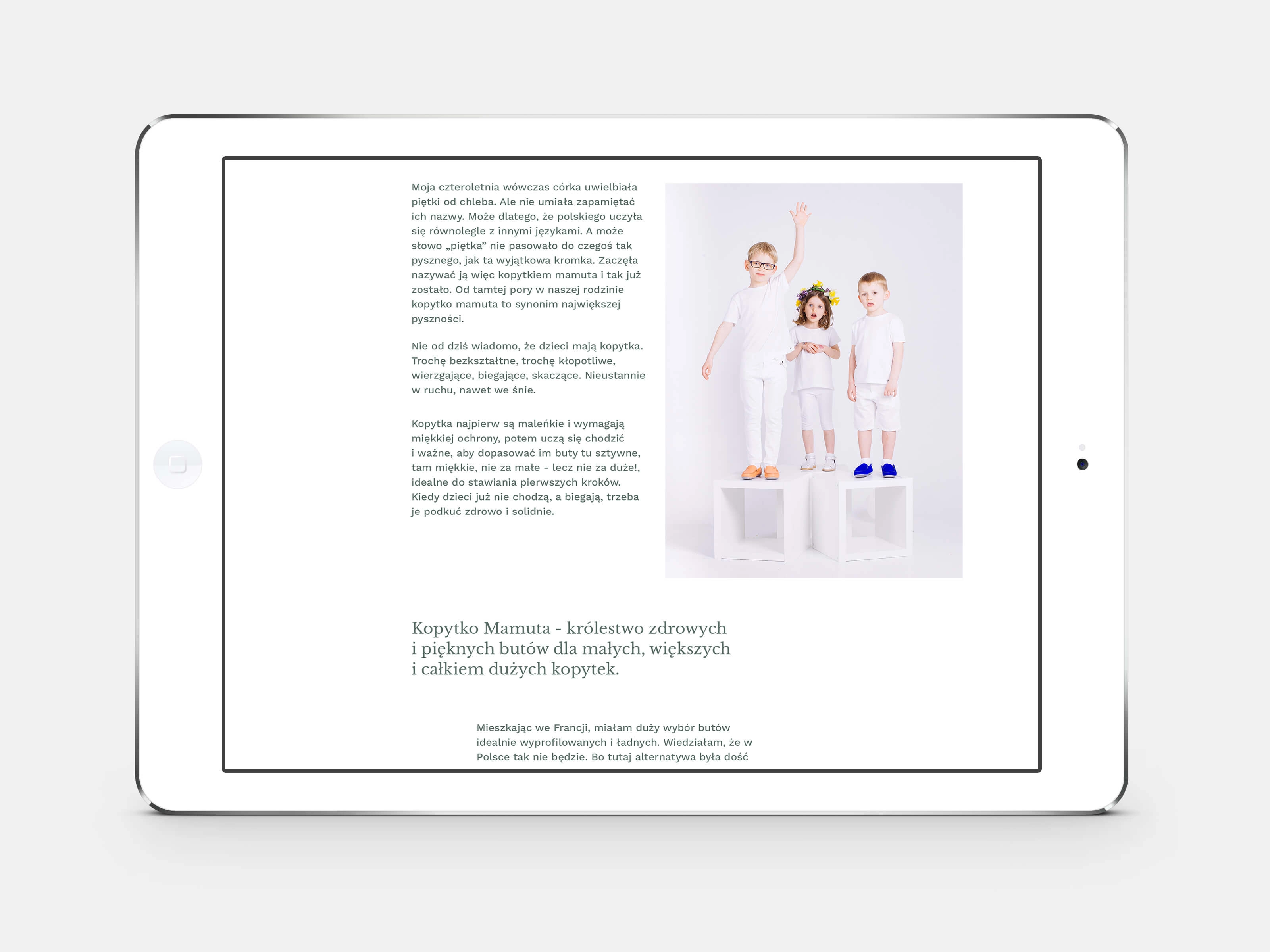
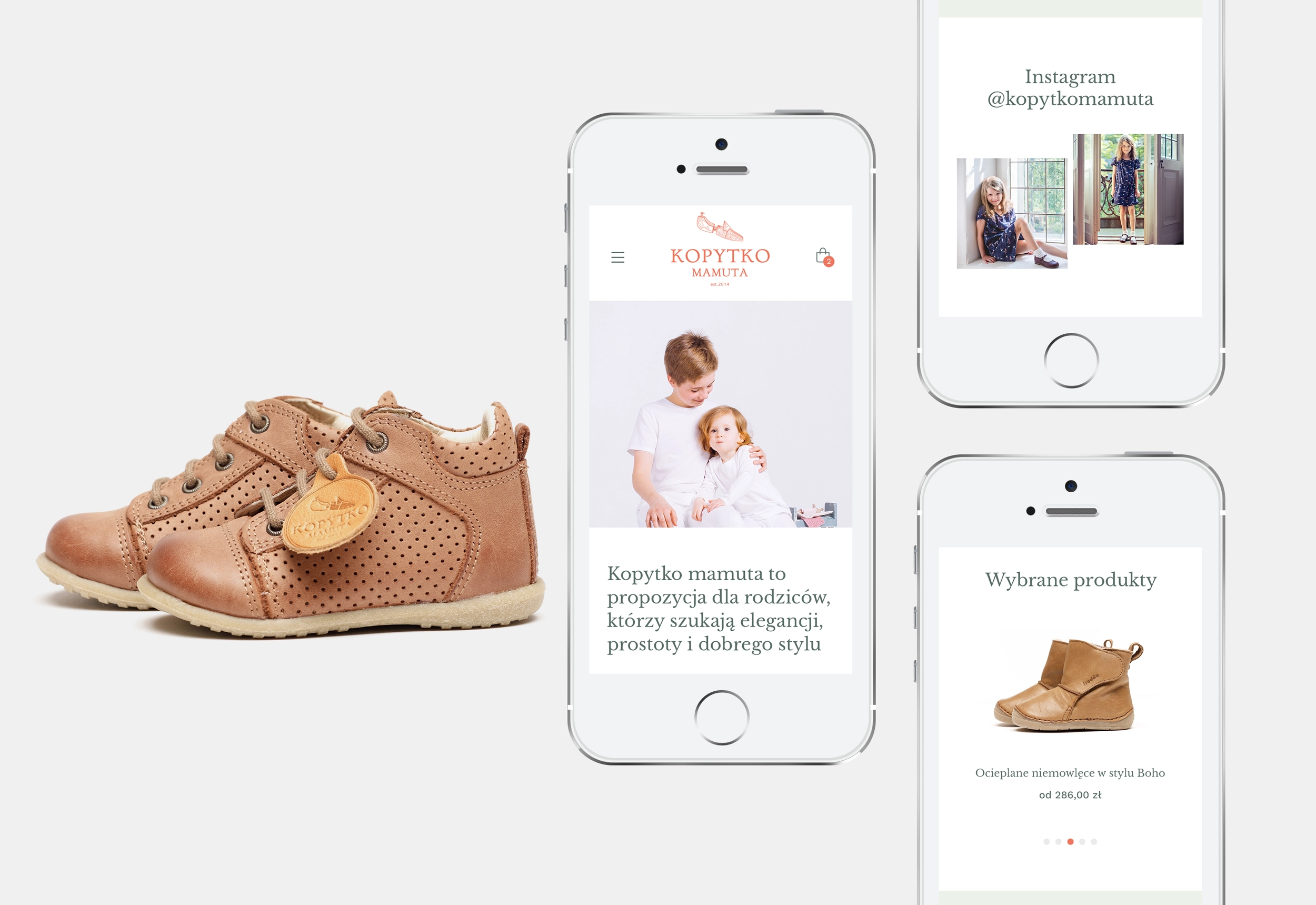
The brief was to redesign the existing website and to introduce online store that is: minimalistic, legible, simple, with lots of light. The new design based on brand identity color palette is easy to navigate and reflects the right balance between classic and modern style.
Services – webdesign (UI design)
Completed at – We Design
Art direction – Aleksander Rokicki
Client – Kopytko Mamuta
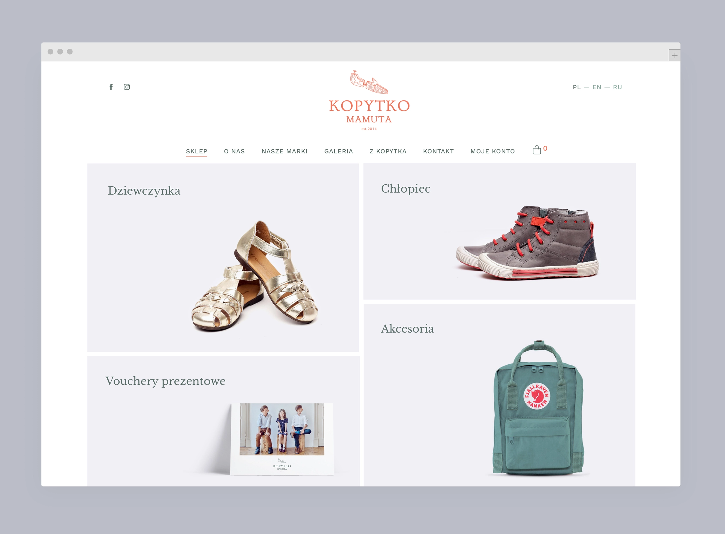
Store clear product grid showing main categories: girls' (shoes), boys' (shoes), gift vouchers, accesories.
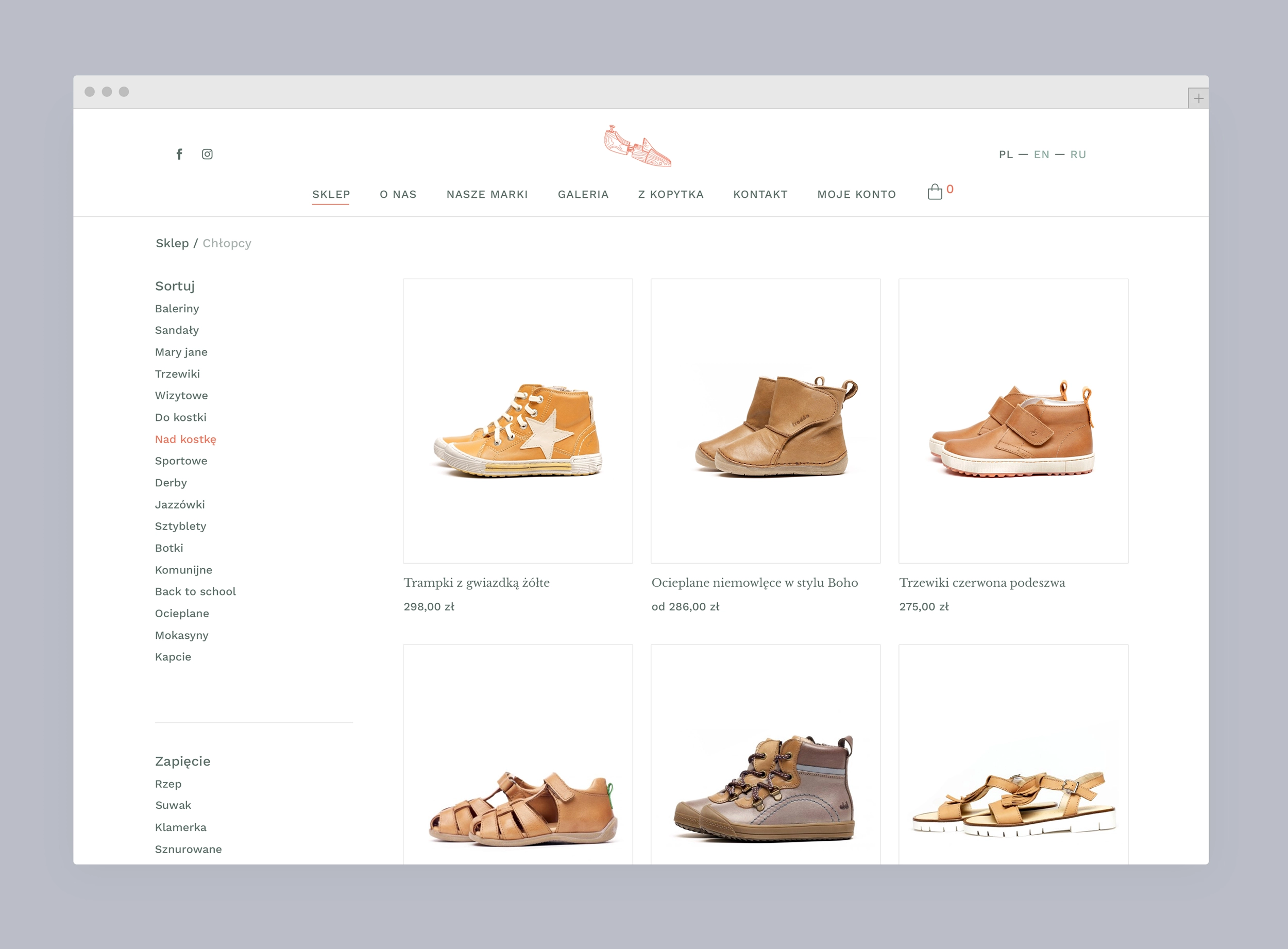
Category Page has additional filters on the left column to help customers narrow the options based on parameters.
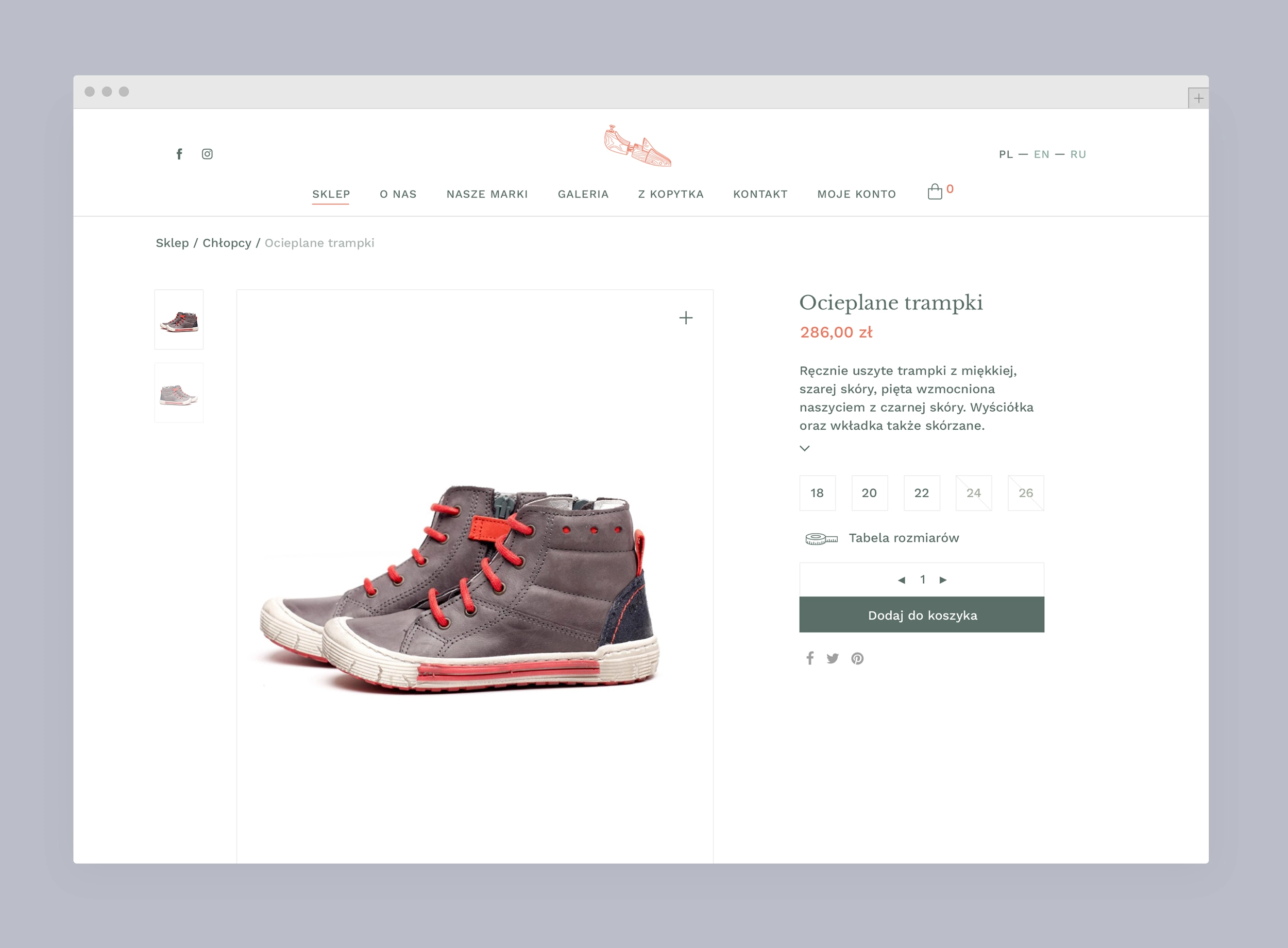
Clean product page following e-commerce best practices – readable product descriptions, breadcrumbs to navigate, visible CTA.
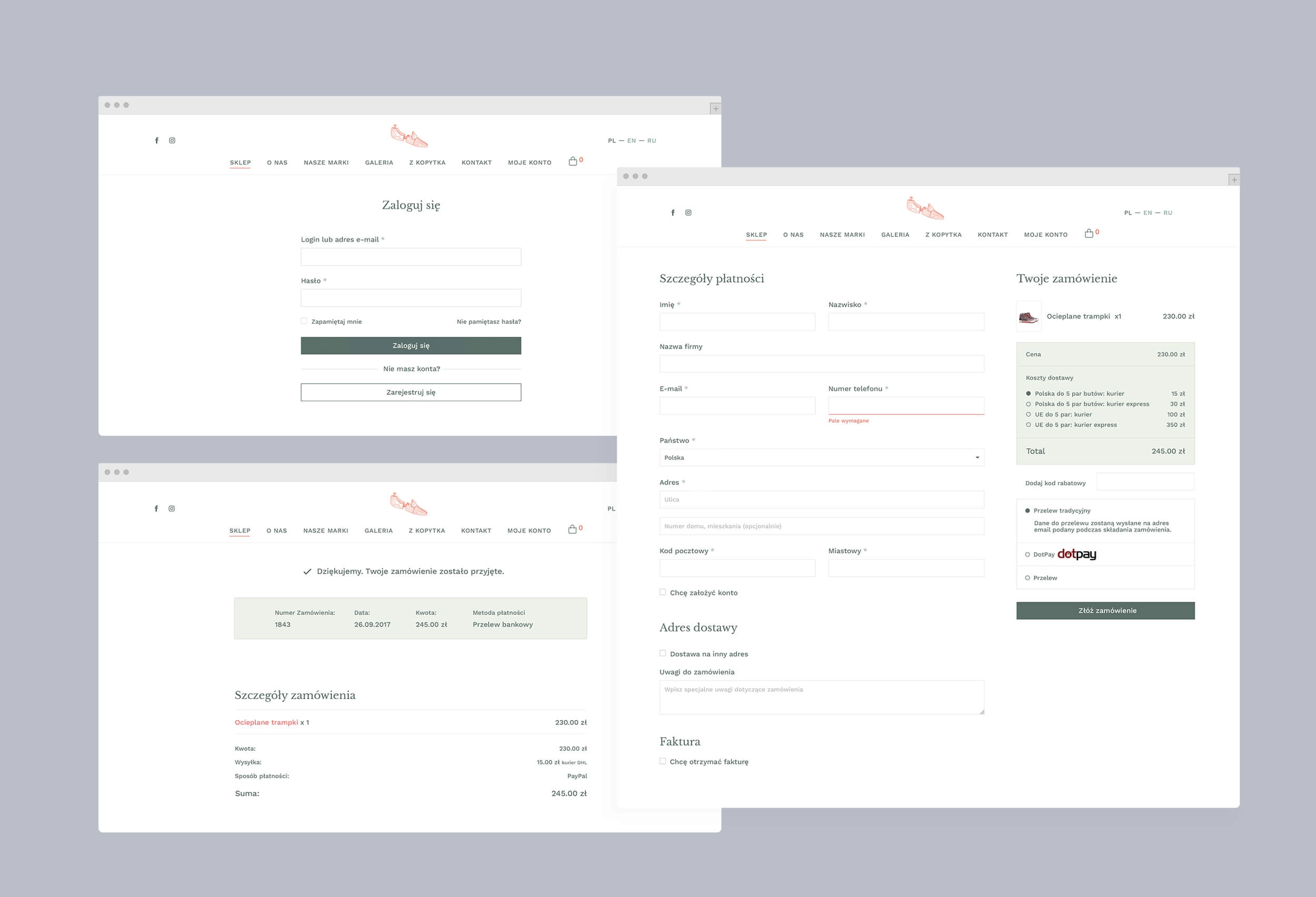
The cart and the checkout process were based on WooCommerce framework, so mockups had to be easily integrated with the system, keeping the look and feel of the rest of the website.
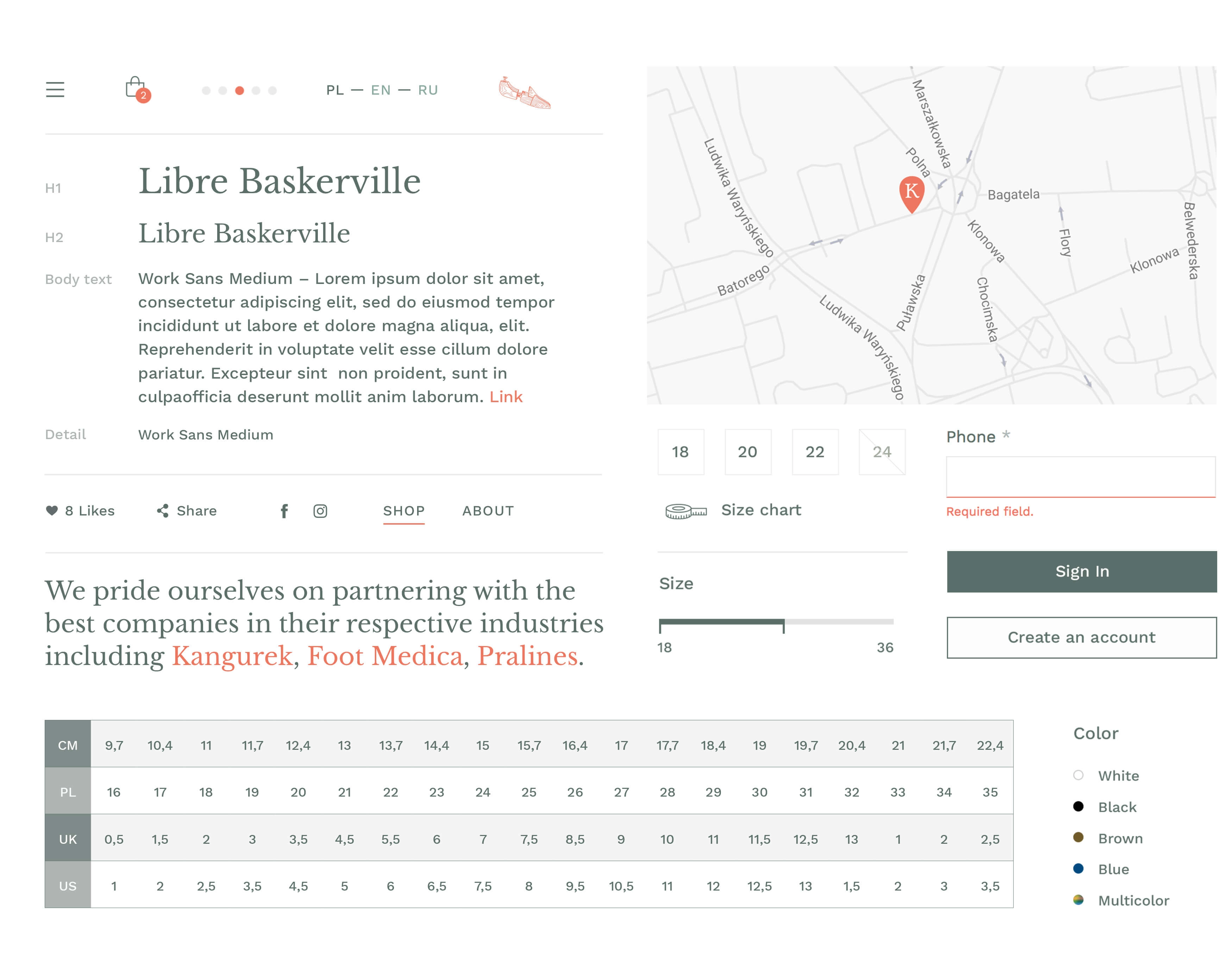
Library of icons, colors, fonts and components used throughout the product
